OWV (Message Wall | contribs) No edit summary |
|||
| Line 231: | Line 231: | ||
'''Nicknames:''' "CGI Shield II", "Shield in the Sky V", "Bannerless Shield III", "WB Shield X", "2020s Shield", "Blue Shield", "Shield of Staleness III" |
'''Nicknames:''' "CGI Shield II", "Shield in the Sky V", "Bannerless Shield III", "WB Shield X", "2020s Shield", "Blue Shield", "Shield of Staleness III" |
||
| − | '''Logo:''' It starts the same way as the previous logo (but probably tinted blue), then we see the new Warner Bros shield without a banner swing in fully upright from the left of screen against the same cloudy sky background as the previous logo. As the shield zooms out into position, the sky background fades to black and the WarnerMedia byline fades in below. |
+ | '''Logo:''' It starts the same way as the previous logo (but probably tinted blue), then we see the new Warner Bros shield without a banner swing in fully upright from the left of screen against the same cloudy sky background as the previous logo. The "WB" text reflects various other clouds. As the shield zooms out into position, the sky background fades to black and the WarnerMedia byline fades in below. The shield shines throughout. |
'''Variant:''' On ''Tenet'' (the first film to use this logo), the logo is tinted red. |
'''Variant:''' On ''Tenet'' (the first film to use this logo), the logo is tinted red. |
||
Revision as of 22:43, 12 September 2020
1925-1929
Nicknames: Brain Shield, Studio Shield, Brain WB Shield, The Early Shield
Logo: On a black background, a large, bizarrely shaped shield is seen, with a very wide top. The top part of the shield shows a picture of the Warner studio in Burbank CA, the bottom having a squashed, stylised "WB". "a WARNER BROTHERS" is above the shield (with "WARNER BROTHERS" in an arc around the shield, a la the first Columbia logo), with "CLASSIC of the SCREEN" below.
Variant: Starting in 1926, "CLASSIC of the SCREEN" changed to "PRODUCTION".
FX/SFX: None.
Music/Sounds: None or the film's opening theme.
Availability: Extremely rare.
Editor's Note: The first design of the WB shield, it's noted by modern viewers for having a strange look to it. However, the addition of the WB Studios inside the shield wouldn't be referenced again until the 1998 logo.
1929-1936
Nicknames: Vitaphone Shield, Shield and Flag
Logo: The words "WARNER BROS PICTURES, Inc." appear, and below that "& THE VITAPHONE CORP." appears in a much smaller font, with the "VITAPHONE" using "electric" style letters. Below that is a very small WB shield (using the stylised WB seen in the 1st logo), and in script, "Present". Behind it there is the drawing of a flag, "waving" so it looks like it is in three sections. On the first one, "WARNER BROS" appears, followed by the electric-letter "VITAPHONE" logo and below that, "PICTURES".
FX/SFX: None.
Music/Sounds: None.
Availability: It's preserved on any film from Warner Bros from this era, including pre-1999 video releases by Magnetic Video, CBS/FOX Video, and MGM/UA Home Video.
Editor's Note: TBA
1934-1937
Nicknames: Zooming Shield, Zooming WB Shield
Logo: Over a cumulonimbus cloud setting, a superimposed WB shield design zooms in to the screen. The words "WARNER BROS PICTURES, Inc. Present" appear over the shield.
FX/SFX: The shield zooming in.
Music/Sounds: The opening theme of the movie.
Availability: It's seen on films from the period and occasionally seen on TCM.
Editor's Note: The zoom-in of the shield is rough, which is typical for logos made before the Scanimate era.
1937-1948
Logo: Inside a shield, a more realistic version of the stylised "WB" as seen in the previous logo appears. Over the shield is a banner that reads "WARNER BROS PICTURES, Inc.". Below the logo is the word "Presents" in script.
FX/SFX: None.
Music/Sounds: The opening theme of the movie.
Availability: Fairly common. It's seen on Warner releases of the period, like Casablanca on TCM.
Editor's Note: TBA
1948-1967
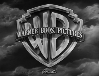
Nicknames: The Classic Shield, The Golden Shield
Logo: Same as before, only the design has been cleaned up a bit. The border of the shield, banner, text, and "WB" are now gold, and the inside of the shield is now blue. The banner phrase is now changed to "WARNER BROS PICTURES" and is now gold. "Presents", in the same font as the previous logo, usually appears below. Also, the background is now a cloud skyline (much like the logos of 1984 on).
Variant: For the logo's later years, it was usually superimposed onto the titles of Warner features of this period.
FX/SFX: None.
Music/Sounds: The opening theme of the movie.
Availability: Seen on many of the Warner Bros films on AMC and TCM.
Editor's Note: TBA
1967-1970
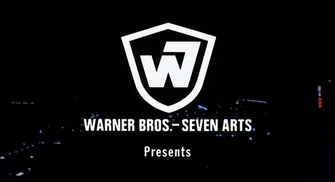
Nicknames: WB-7, W7, Lucky Number 7 on WB, W7 Shield
Logo: Just a superimposed, stylised shield which can be white, yellow or red. The shield features a combination of a "W" and a "7", representing Warner Bros-Seven Arts. The "W7" is often drawn on screen, a la the NBC Snake, although it's a still logo on a few films. Below the shield, "WARNER BROS-SEVEN ARTS" is seen. The word "Presents" usually appears under the shield.
FX/SFX: The "trace", sometimes done over the backdrop of a specific movie.
Music/Sounds: None or the opening theme of the movie.
Availability: Rare. It's seen on some Warner Bros films of the period, although WB usually replaces it with a newer logo.
Editor's Note: This is the first time the WB name (and its logo) has been altered in its 50+ year history.
1970-1972
Nicknames: Gasoline Shield, Shield Stretch, The Kinney Shield, Long Shield, The Kinney WB Shield
Logo: Over a blue background is an abstract shield (like those seen on WB movie posters in the '60s) in a golden colour with a dark brownish colour inside. A simple lettering of the WB appears at the upper part and a rectangle of the same colours appears at the lower part of the shield, with the Kinney byline inside. The word "PRESENTS" appears underneath the logo.
Bylines:
- May 13, 1970-June 25, 1971: "A KINNEY NATIONAL COMPANY"
- April 18-May 1, 1971: "A KINNEY SERVICES COMPANY"
- June 17-September 30, 1971: "A KINNEY LEISURE SERVICE"
- December 19, 1971-February 25, 1972: "A KINNEY COMPANY"
FX/SFX: None.
Music/Sounds: None or the opening theme of the movie.
Availability: As we all know, Warner was incredibly shoddy with logo preservation until recently. AMC and TCM showings of Warner movies MAY include this logo, but expect one of the more recent WB shield logos, most likely the Warner Communications and Time Warner (not Time Warner Entertainment) variations.
Editor's Note: The shield's simplistic design reflected the style of other logos produced during this era.
1972-1973
Nicknames: WCI Shield, Early WCI Shield, Tiny Shield, Mini Shield, Bannerless WB Shield
Logo: The standard WB shield logo, without the banner. It is on a blue background with "A WARNER COMMUNICATIONS COMPANY" underneath. "Presents", in script, may appear below.
FX/SFX: None.
Music/Sounds: None or the opening theme of the movie.
Availability: Ultra rare.
Editor's Note: TBA
1973-1984
Nicknames: The Big "W", \\', The Worms, The Round W
Logo: On a black background, a red abstract "W" consisting of two slanted elongated circles and a shorter elongated circle zooms in towards us. Around halfway through, the words "WARNER BROS" (in the Warner Communications custom typeface) appear below it. The red logo overtakes the screen as a smaller white "W" zooms in. It stops at the middle of the screen and a black square field, whose corners have been rounded and softened, fades in around the logo. "A WARNER COMMUNICATIONS COMPANY" in the same font used for "WARNER BROS" fades in below. Most of the time, "PRESENTS" fades in after that (in Helvetica).
FX/SFX: The zooming in of the "W".
Music/Sounds: Usually silent, but some movies have the beginning of the movie's theme playing over it.
Availability: Rare.
Editor's Note: TBA
1984-2001
Nicknames: The Shield Returns, Shield of Staleness, Shield in the Sky
Logo: Over a set of clouds, the WB shield appears (including the banner reading "WARNER BROS PICTURES"), with the byline underneath.
Bylines:
- June 8, 1984-September 14, 1990: "A WARNER COMMUNICATIONS COMPANY"
- March 9, 1990-February 26, 1993: "A TIME WARNER COMPANY"
- August 14, 1992-February 2, 2001: "A TIME WARNER ENTERTAINMENT COMPANY"
Variants:
- For some of their earlier films, and for films that had this logo plastered on over older logos, the word "PRESENTS" faded in a couple of seconds afterwards, like on WB films that originally used the 8th logo.
- Scope films used a different cloud background, which was also used for the logo's television counterpart during the Warner Communications era.
Closing Variants:
- 1984-1998: The end logo, seen at the end of most movies, features a simple superimposed WB shield (without a banner), much like the short lived logo from mid-1972. The phrase "DISTRIBUTED BY WARNER BROS" appears above the shield with the byline at the bottom. On films from 1984-roughly 1989, it would use the "Big W" logo.
- A few movies had a variant where the "Big W" logo was bigger than normal.
- On films from 1986-1990, the in-credit logo used the previous logo font with a WB shield.
- December 8, 1988-March 22, 2000: Another ending variation features the movie logo, but with the words "DISTRIBUTED BY WARNER BROS" above the shield.
- May 12, 2000-February 2, 2001: Only the words "DISTRIBUTED BY" appear above the shield, the "WARNER BROS PICTURES" text is redone. Some releases like The In Crowd, Get Carter, and Miss Congeniality have the banner reading simply "WARNER BROS". Also added is the URL, "www.warnerbros.com" below the byline.
FX/SFX: None.
Music/Sounds: In most cases, silent or the beginning of the movie's theme is used. For some of their first features (such as Gremlins), a loud and majestic horn sounder (a classic WB fanfare) is heard.
Availability: Extremely common. The 1992 version is the easiest find, as it is usually the one that plasters older logos. WB has eased up on this somewhat, and older logos have been seen more often in recent years on newer prints.
Editor's Note: A throwback to the 50s shield, though a bit too frequent as well, due to this logo plastering other older logos.
1998-2020
Nicknames: CGI Shield, Shield in the Sky 2, CGI WB Shield
Logo: A picture of the Warner Bros Studios in Burbank, CA is seen with a gold tint. The picture "ripples" slowly for a bit then rotates, revealing that it is the WB shield, redone in CGI and reflecting the studio. The cloud background is more computer generated. The logo rotates towards us and zooms out to its usual position, with the company byline fading in underneath.
Trivia: This logo was created by Intralink Film Graphic Design.
Bylines:
- January 16, 1998-February 2, 2001: "A TIME WARNER ENTERTAINMENT COMPANY"
- February 16, 2001-September 12, 2003: "An AOL Time Warner Company"
- November 5-December 5, 2003: "A Time Warner Company"
- December 12, 2003-June 15, 2018: "A TimeWarner Company" (with "TimeWarner" in its own logo font, called Bodoni Bold, while the rest of the byline is in the FF Meta typeface).
- September 23, 2016-September 22, 2017: "A TimeWarner Company" (with "TimeWarner" in its own logo font, called Bodoni Bold, while the rest of the byline is in the Proxima Nova font and is smaller than the TimeWarner logo). This was only used on the Warner Animation Group films Storks, The LEGO Batman Movie, the teaser trailer for The LEGO Ninjago Movie, the trailers for Teen Titans Go! To the Movies, and the trailers for Smallfoot.
- July 21, 2018-August 7, 2020?: "A WARNERMEDIA Company" (with "WARNERMEDIA" in its own logo font, called 'AT&T Aleck Sans Bold', while the rest of the byline is in the standard variation of the same font).
Variants:
- January 16-December 18, 1998: For the logo's first year, when the logo is zooming out, "75" and "YEARS" appear from behind the shield and move away to surround it. "Entertaining the World" fades in underneath, followed by the Time Warner Entertainment byline in white instead of orange. Also, the shield and the background are slightly enhanced.
- A somewhat enhanced WB shield in 3D was spotted on 3D international prints of Beowulf. The animation revealing the shield is quicker, the flash reflection on the banner when the shield is revealed is not as bright, the inside of the shield is a brighter blue, the banner around the shield is shinier, the cloud background is further back, and the shield zooms out further more.
- A version of the logo exists in which Bugs Bunny walks from the shield, does a Vanna pose, and eats a carrot, but the banner still reads "WARNER BROS PICTURES". This version was used for Warner Bros Family Entertainment for a short time.
- Starting in 2011, the shield is sleeker, the banner is shinier, the byline is orange-yellow, and the animation revealing the shield is enhanced. Although some films still use the 2003-2011 version.
Closing Variants:
- 1998-February 2, 2001, May 17, 2002, March 5, 2004: Same as the previous logo.
- February 16, 2001-August 7, 2020?: The closing logo features the 1984 shield with the banner updated to match that of the current opening logo, the words "Distributed by" appear over the shield with the URL underneath the byline.
- A scope version of the closing logo has a much more zoomed out shield, much like the IMAX variant. This was spotted on We Are Marshall.
FX/SFX: The scenery ripples, a golden shield appears and focuses into view.
Music/Sounds:
- January 16-December 18, 1998: The original 75th Anniversary version of this logo used a wind-blowing chime fanfare.
- February 12, 1999-August 7, 2020?: An 8-note piano tune that builds into a powerful, moving fanfare, based on the theme from Casablanca, "As Time Goes By".
- In other cases, it uses the opening theme of the movie or silence.
Music/Sounds Variants:
- On current prints and HBO airings of U.S. Marshals and The Negotiator, the 2003 version of this logo with the TimeWarner byline uses the wind-blowing chime tune from the original 75th Anniversary version. The 1999 DVD and 2009 Blu-Ray of the latter retain their original 75th Anniversary logo.
- On current prints of Innerspace and Caddyshack II, this plastered the Warner Communications version of the previous shield, but kept the horn fanfare.
Availability: Very common.
- It's seen on most WB films from 1998 to about mid-2020, starting with Fallen and possibly ending with An American Pickle. Several pre-1998 films have had their old logos plastered with this one in lieu of the "Shield of Staleness", though this one is mainly found on the most recent releases.
- The 75th Anniversary variant can be found on Warner Bros films released between January 16-December 18, 1998. In most cases, the logo uses music, especially post-2001 when the AOL Time Warner byline version was used.
- The one with the AOL Time Warner byline can be found on films released between 2001-2003.
- The WarnerMedia byline version first appeared on the teaser trailer for Aquaman, and made its first official appearance on Teen Titans Go! To the Movies, the TimeWarner byline made its last appearance on the IMAX re-release of 2001: A Space Odyssey.
- May or may not be plastered by the Toho logo on Japanese prints of Godzilla.
Editor's Note: It held up remarkably well over the twenty-two years it was used, though some people might be annoyed due to it plastering some older logos, just like its predecessor.
2020-present
Nicknames: "CGI Shield II", "Shield in the Sky V", "Bannerless Shield III", "WB Shield X", "2020s Shield", "Blue Shield", "Shield of Staleness III"
Logo: It starts the same way as the previous logo (but probably tinted blue), then we see the new Warner Bros shield without a banner swing in fully upright from the left of screen against the same cloudy sky background as the previous logo. The "WB" text reflects various other clouds. As the shield zooms out into position, the sky background fades to black and the WarnerMedia byline fades in below. The shield shines throughout.
Variant: On Tenet (the first film to use this logo), the logo is tinted red.
Closing Variant: Just the finished logo, with "Distributed by" above and the URL below.
FX/SFX: Decent CGI.
Music/Sounds: So far, the opening theme of the movie.
Availability: Brand new. This debuted on Christopher Nolan's Tenet as a variant, and the normal version is planned to be seen on future films from company.
Editor's Note: A good evolution of the previous logo, although it's far less grand due to the stiffer animation. It is also the first time since 1972 that the shield does not have the banner around it.


