1st Logo[]
1980-1987[]
Nickname: Filmstrip M
Logo: On a black background, we see a filmstrip, made into a letter "M". The text "MIRAMAX FILMS" is next to the "M" with "in association with" above.
Variant: On some films, such as Crossover Dreams and The Quest, the logo is a simple textual graphic reading "A MIRAMAX FILMS Release" in a plain non-serif font.
FX/SFX: None.
Music/Sounds: Silent, or the music from any given soundtrack.
Music/Sounds Variant: On some prints of David the Gnome, the last note of the Cinar logo is played.
Availability: Very rare. It was seen on their limited output of that era such as Rockshow and The Secret Policeman's Other Ball, among others. The English-language print of David the Gnome also had that logo when it aired on Nickelodeon and TLC in the US, Family Channel in Canada, and across several other English-speaking territories, however it isn't preserved on DVDs of the show. It is intact on the US Family Home Entertainment and UK The Video Collection VHS releases.
Editor's Note: None.
2nd Logo[]
1987-1998[]
Warning: That and the CLG Wikia are PG-rated wikis. If the logo is followed by the View Askew Productions logo in Clerks, don't put videos in that page.
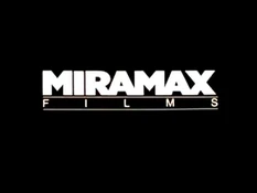
Nickname: The Banner of Boredom
Logo: On a black background, we see the text "MIRAMAX" in the Gill Sans Ultra Bold font. Below it is "FILMS", stretched to fit the width of "MIRAMAX", with a line on top and on the bottom of it.
FX/SFX: None.
Music/Sounds: None or the theme of the movie or trailer.
Availability: Rare. It's found on mainly trailers for some Miramax features and films such as The Unbelievable Truth, My Left Foot (VHS only) and Blue in the Face. It also makes appearances on Clerks and the 2002 and current prints of A Hard Day's Night (1964).
Editor's Note: None.
3rd Logo[]
1987-2006[]
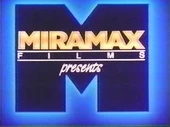


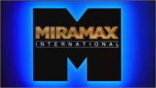


Nicknames: The M, The Big M, Flashing M, The Miramax M, The Blue M
Logo: On a black background, a blue "M" in the same font as before zooms out to the left of the screen. It scrolls to the right, revealing "MIRAMA" in gold, and when it gets to the end, it disappears in a flash of light, revealing an "X". The word "FILMS" with its usual lines fading in below. A large "M" in black with a glowing blue corona surrounding it zooms out and borders the logo.
Variants:
- For a number of years until Disney acquired the company, the word "presents" in script, would appear under the logo, depending on the variant.
- For releases outside of the U.S. only, the word "FILMS" was replaced with "INTERNATIONAL", the logo is less cheesy than before, and the flash of the outlined "M" is more flashy.
- On at least one occasion, the Roadshow Television logo transitioned into the international variant by zooming out with the "M".
- On some films, such as The Wings of the Dove, the "FILMS" text is omitted.
- On some widescreen versions of the logo, the top and bottom edges of the "Big M" touch the black borders, or are cut off.
- Sometimes, the logo fades out early while the rest of the music plays.
- Rarely, the text would be silver.
- On Ready to Wear, when the "M" zooms out, the entire logo zooms out even further.
FX/SFX: The zooming out of the "M", the glowing letters, the flash, and the "Big M".
Music/Sounds: A calm synth theme. Some films have the opening theme of the film, or is silent.
Music/Sounds Variants:
- On Pulp Fiction, the last two notes of the fanfare were cut off.
- On films such as Don't Be a Menace to South Central While Drinking Your Juice in the Hood, the double pitched music from the Family Films variant of the logo is heard.
Availability: Used to be common, but due to chronic plastering with both 4th and 5th logos, now it's uncommon bordering on rare. Examples with that are recent releases of Pulp Fiction and Sling Blade. That logo first appeared on I've Heard the Mermaids Singing, and made its last appearance at the end of Music of the Heart (which uses the next logo below at the beginning). The international variant is only seen on releases outside of the US, such as Australian prints of the Scream films, and UK prints of the Jackie Chan film Thunderbolt. However, it has appeared on some Region 1 DVDs of foreign films like Farewell My Concubine. The "presents" variant appears on the R1 DVDs of Strictly Ballroom, Kolya, the Live Entertainment releases of The Crying Game, the VHS releases of The Grifters, Tie Me Up! Tie Me Down!, the Canadian release of Prospero's Books, and the Canadian Seville Pictures DVD of Breaking the Rules, among others. Don't expect to see that logo on Bob Roberts. Despite the print logo appearing on posters and trailers, only the 1990 Paramount Pictures logo is used on-screen. It was also originally seen on U.S. theatrical prints of Freddie as F.R.O.7 and Tom and Jerry: The Movie, but the home video releases show no evidence, though in the case of the former, it's an alternate cut. Strangely, that can be seen on The Crow: City of Angels, but Dimension distributed the film. It was also spotted on the 1999 HBO DVD of My Left Foot, and is preserved on the Anchor Bay DVDs of Strapless and The Cook, the Thief, His Wife & Her Lover. It is also seen on early U.S. prints of Princess Mononoke while later prints use the next logo. It was also seen on the Canadian VHS release of The Girl in a Swing, despite that Millimeter distributed the film to U.S. theaters. Don't expect to see that on current prints of Reservoir Dogs. That may have been seen on theatrical prints of The Long Walk Home, but VHS releases skip the logo (despite its presence on the box).
Editor's Note: One of the more iconic movie logos of the 90s. That logo utilizes an effective use of cel animation.
4th Logo[]
1998-2008[]


Nicknames: The Buildings, Lights in the Big City, Manhattan Skyline, The City, Miramax Skyline
Logo: We zoom down a river, and pan up to see the skyline of Manhattan, New York, at sundown. As the sun sets, the lights in the building windows begin to turn on, like normal when it is sundown. As we zoom in closer to the buildings, several lights begin forming the print Miramax Films logo, simply in white (no glowy effects like last time). The city skyline fades to black as the Miramax Films logo forms, piece by piece, while zooming towards the center of the screen. The end result is similar to the 2nd logo.
Trivia: If you look hard enough, you possibly may see the World Trade Buildings. That was animated long before the original World Trade buildings collapsed on 9/11. On recent films shot on digital, the right tower is removed and the left one is placed to the edge of the city skyline.
Variants:
- From 1998 until 2005, the logo was shot on 35mm film. In the logo's final years from 2006-2008, it is shot on digital.
- For that logo's first official year (1999, even though that logo debuted in 1998), the words "20TH ANNIVERSARY" appear above.
- There's a prototype variant of the "20TH ANNIVERSARY" logo where the top text is in orange or yellow, depending on the film quality.
- Yet another variant of the "20TH ANNIVERSARY" version exists. On a couple of films released in 1999, the anniversary text is smaller.
- For releases outside the United States, the word "FILMS" was replaced with "INTERNATIONAL". There's an anniversary variant of that version also.
- There exists a 1.78:1 open-matte version where the landscape is zoomed out much farther back. That version is seen on the Miramax DVD releases of Three Colors: Blue, the Japanese horror film Ikio, and on some films released between 2007 and 2008 such as The Queen.
- On the U.S. releases for Ella Enchanted (2004), the skyline fades out as usual, but instead of stopping when the Miramax text finishes appearing, the word "FILMS" appears below it while the surroundings change to a Middle Ages-esque version of the skyline.
FX/SFX: The CGI effects are nothing short of perfect.
Music/Sounds: The logo is usually silent, or has the opening theme of the film playing over it. Although some films, such as Music of the Heart, have a pleasant orchestrated piece with few instruments in the selection.
Music/Sounds Variants:
- On early films with this logo such as Children of Heaven, and pre-1998 films such as The Harmonists and Mouth to Mouth, it uses the theme from the last logo!
- On some older HDTV airings and the UK StudioCanal Blu-ray of Shaolin Soccer, it uses the shortened theme from the next logo, possibly due to a botched plaster job.
Availability: Uncommon. Seen on releases from 1998 to 2008 and was the norm for plastering the previous logo, but is replaced with the next logo on most newer prints of their film library. That logo first appeared on Shakespeare in Love, and made its final theatrical appearance on The Boy in the Striped Pajamas. Gangs of New York (2002) doesn't have that logo at all. In an interesting occurrence, when Confessions of a Dangerous Mind airs on Starz/Encore, the standard-definition version retains that logo, but the high-definition showing features the next logo below instead. VHS tapes and DVDs of movies released during that logo's span are almost always guaranteed to have that logo, such as Pokemon Heroes.
Editor's Note: Despite the nice CGI, some people don't like how that plastered the previous logo on some films.
5th Logo[]
2008-2018[]


Nicknames: The Buildings 2, Lights in the Big City 2, Manhattan Skyline 2, The City 2, Miramax Skyline 2
Logo: Same concept as before, but instead of the skyline, we pan up to see the Brooklyn Bridge at sundown. As the sun sets, we zoom towards the buildings until we finally get to the skyline of Manhattan. One difference of the skyline is that the World Trade buildings are gone (possibly due to 9/11). After we get to the city, the lights in the building windows begin to turn on, like normal when it is sundown. As we zoom slowly to the skyline, several lights begin forming the Miramax Films logo like before. The city skyline then fades to black as the Miramax Films logo forms, piece by piece.
Trivia: That logo was made by Studio Nos.
Variants:
- Since 2010, most films only show the last half of the logo.
- Starting in 2011, the word "FILMS" is suspended. That variant first appeared on The Debt. Both of these versions (particularly the latter) plaster over older Miramax logos on new releases of their films.
- Starting in 2017, a registered trademark ("®") symbol appears next to the Miramax wordmark.
- On recent prints of My Life So Far (2002), this plastered the “20th Anniversary” variant of the previous logo, but for some reason, they keep the “20th Anniversary” text.
- The closing version has just the Miramax logo and the city skyline.
FX/SFX: A marvelous hybrid of live-action and CGI effects.
Music/Sounds: Usually, a soft piano tune with coastal and city noises. Sometimes, it is silent or has the opening theme of the movie.
Music/Sounds Variant: On some recent prints of their 1987-06 films, such as Jackie Brown and Il Postino (The Postman), it uses the music from the 1987 logo!
Availability: Common. It first appeared on Doubt, and made its final appearance on Whitney. It also plasters older Miramax logos on recent prints of films. Strangely, it appears before the 1990 Walt Disney Pictures logo on Runaway Brain when it was a digital-exclusive extra on Walt Disney Animation Studios Short Films Collection.
Editor's Note: Once again, that logo is well liked, but some people are annoyed how it plasters older Miramax logos.
6th Logo[]
2018-Present[]
Nicknames: The Buildings 3, The City 3, Aurora Miramaxius, The Big M Returns
Logo: We see three sets of Light Rings (2 of the 'R', and one of the 'M'), soon followed by the company name, spread out, slowly coming together to form the logo, illuminating a city below. The respective byline fades in.
Bylines:
- 2019-2020: A beIN MEDIA GROUP COMPANY (in variations of the Gotham font) underneath the "MAX" text.
- 2020-2022: A beIN MEDIA GROUP AND VIACOMCBS COMPANY, with "VIACOMCBS" being the corporate logo, centered underneath the logo.
- 2022- : A beIN MEDIA GROUP AND PARAMOUNT COMPANY (In Peak Sans)
Variant: There's a shorter version, which skips the first pan across the 'R'.
Trivia: The logo was animated by MOCEAN.
FX/SFX: Amazing CGI animation!
Music/Sounds: A somber four-note theme, or the opening soundtrack of the movie.
Availability: First appeared on the final trailer for Halloween (2018), and debuted on the film itself. The shorter version first appeared on The Perfection. The full length version is expected to appear on new films by the company released in theaters, while the shorter version will most likely only appear on Netflix exclusive films. While The Paramount Byline First Saw On The TV section,Then Made There First on-screen Appearance On Confless,Fletch,Later Appeared On Halloween Ends,And Made There Final Appearance On Free Kids,Relased On November 30,2024. The new logo is expected to premiere in 2028, if Miramax is consistent, the logo will be another amazing one.
Legacy: That is the first time Miramax hasn't used the Manhattan skyline concept since 1998.