1984-2012
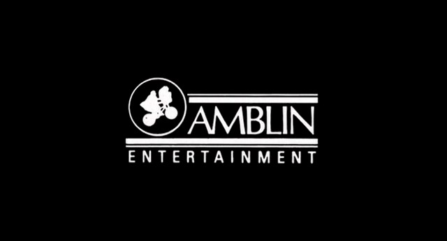
Nicknames: The E.T. Logo, In-Credit E.T. Logo
Logo: A still version of the Amblin logo in white, with an inverse silhouette of Elliott and E.T. flying in front of the moon (represented by an outline) and "AMBLIN" to the right in a font known as Optima; the design is identical to that of Amblin's print logo.
Variant: On Gremlins, the logo appears in the color scheme used from the standard version of the logo, but with the "moon" colored blue; "AN" is above the logo, and "PRESENTATION" is below it, both in red.
FX/SFX: None, unless one wants to count the logo scrolling up near the end of the end credits on some of these films.
Music/Sounds: Music from any given soundtrack.
Availability: The in-credit Amblin logo debuted on Gremlins, and can also be seen on Fandango, all three Men in Black films, and The Mask of Zorro.
Editor's Note: None.
1985-2014, 2018
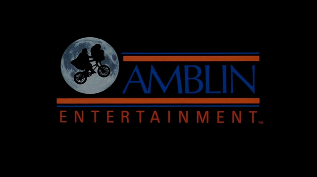
Nickname: The E.T. Logo 2
Logo: We see a close-up of the moon, which zooms backward until it is on the left side of the screen. Right before the moon stops in its place, a silhouette of a young boy on a bicycle (Elliott from E.T. the Extra-Terrestrial) slowly flies in front of the moon from the left side of the moon's border, stopping in the middle (even when the bicycle stops, the wheels continue to move). At the same time, two red/blue stripes move in from both sides of the screen. The stripe that comes in from the bottom left side places itself right underneath the moon, while the stripe that comes in from the top right side places itself near the top of the moon (this creates a small space to the right of the moon bordered by the stripes on the top and the bottom). When the moon and stripes are in place, the word "AMBLIN" appears in a strange fade-in (shadows form the blue letters one at a time, referred to as a "shadow wipe"). When the word "AMBLIN" is finally revealed, the wheels begin to stop and smaller red text appears under the bottom red/blue lines that reads "ENTERTAINMENT" in spaced out letters to fit the width of the bottom line. Both words are in a similar thin font.
Variants:
- A shorter version shows the moon and stripes in place without animation, and it just shows the fade in of the company name. This version first appeared on Who Framed Roger Rabbit, and made its last appearance on Catch Me If You Can.
- On some movies such as The Goonies, Joe Versus the Volcano, Cape Fear, Hook, and A Far Off Place, the moon is flipped backwards.
- A still version appears at the end of War Horse, Lincoln, and The Hundred-Foot Journey (The final movie to use this logo; with the closing theme), as well as some TV shows from Amblin.
- A black & white version of the logo appears at the end of Hereafter.
FX/SFX: The moon zooming backward, the boy on the bicycle appearing and its wheels moving, the red/blue stripes coming from both sides, "AMBLIN" shadow-wiping in. It's all traditional animation.
Music/Sounds: A light orchestral theme composed by John Williams was used with this logo on Young Sherlock Holmes, The Color Purple, The Money Pit, and the 1988 video release of E.T. the Extra-Terrestrial. However, it is usually silent, or has the film's closing score.
Availability: Common. The flipped moon variant debuted at the end of The Goonies while the normal variant debuted at the end of Back to the Future, and can be found on every Amblin film from this era (except Schindler's List, The Bridges of Madison County, Minority Report, Flags of Our Fathers, and Letters from Iwo Jima, as well as the three Amblimation productions, which featured that company's special logo, and the aforementioned with the 1st/print logo on the credits). Most prints of E.T. the Extra-Terrestrial don't show this logo despite showing the logo on the packaging, except on the 1988 home video release of the film. The last film to use this logo was The Hundred-Foot Journey. This logo makes a reappearance on The House with a Clock in Its Walls, fitting with the retro theme.
Editor's Note: None.
2015-present

Nicknames: The E.T. Logo 3, CGI E.T. Logo
Logo: Same concept as before, only CG is used, and the moon and silhouette are three-dimensional. The moon swooshes down and hovers to the left of the screen, while Elliot and E.T. fly on the screen from behind, making an immediate right in front of the moon and parking to form the graphic. Also, the word "AMBLIN" no longer has the strange shadow wipe effect, and instead uses a more gradual fade-in from the left, and the rest of the logo (the orange and blue bars and "ENTERTAINMENT") fades in. The finishing background is now red-gradient black (evening sky). If you look closely, you can see E.T.'s finger glowing.
FX/SFX: Fantastic CGI!
Music/Sounds: The ending of the orchestral theme from the previous logo, the opening theme of the movie or silence.
Availability: Debuted after the Universal logo on Jurassic World and has appeared on all Amblin films since (save for The House with a Clock in Its Walls, which used the previous logo). The version with the theme debuted on The BFG.
Editor's Note: None.